good logo designs are under valued. here’s a recap of some national hockey league (nhl) logos w/ hidden meaning.
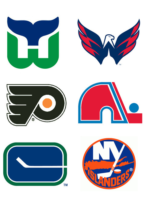
the Hartford Whalers logo (top left) is arguably the most famous sport logo, featuring the ‘whale tail’, ‘W’ in green and inverse ‘H’. similarly, the Washington Capitals (top-right) have a cool logo f/ a ‘W’ and inverse ‘capitol building’ that’s clever.
the Philly Wings logo (middle) f/ a ‘P’ + wings. the old-school Quebec Nordiques have a small ‘q’ outline w/ the hockey stick included, plus the small ‘n’ for Nordiques that’s very chill.
the Vancouver Canucks (bottom) old-school unis formed a ‘C’ with the hockey stick, plus there is a rink outline. the NY Islanders logo isn’t as dope, h/r, it does have a nice touch with the ‘I’ pointing to the local of the arena on the map. their new logo also has four roles of tape around the stick to rep their four lord Stanleys.
hopefully we see more subtle hidden meanings in feature designs. some of today’s looks are just way too over the top.
note: for the best source for logos, visit Chris Creamer’s sportslogos.net